‘Featured’ today looks at the 10year relationship between Harris Scarfe Red Design Group. Harris Scarfe were one REDS foundation clients , and together in collaboration over 100 individual projects were completed.
Below is a snapshot of the journey.
-Westlakes-
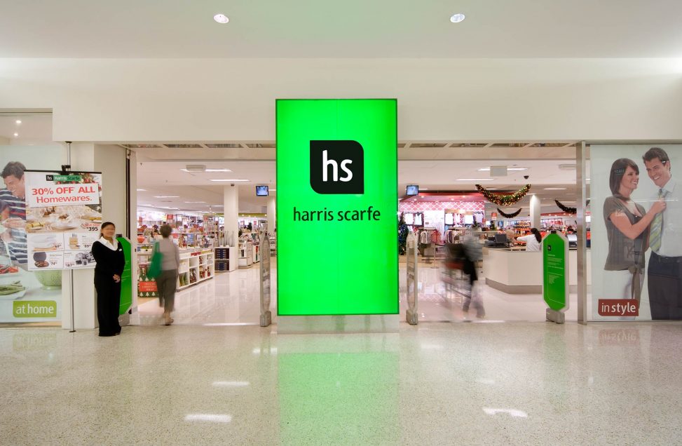
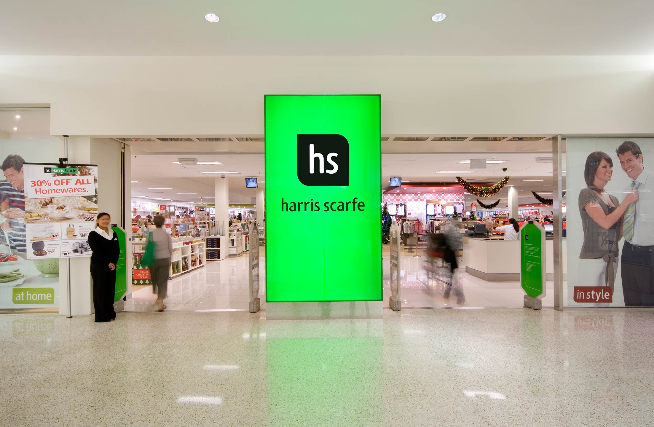
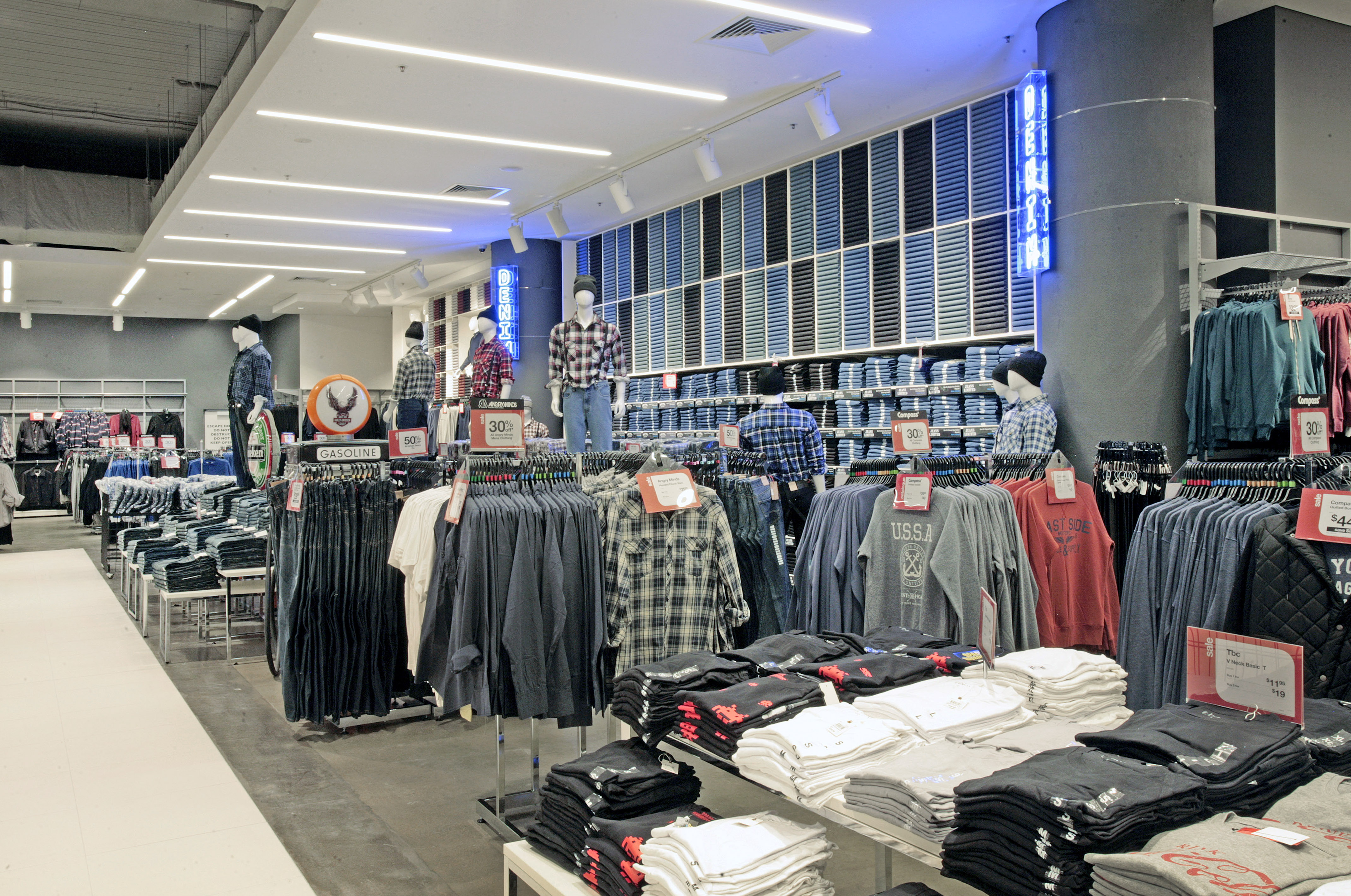
After a management buyout of the defunct Adelaide based department store business, Robert Atkins had ambitious plans to turn around the iconic retail brand. The goal he set was to create a ‘speciality big box’ format which gives Harris Scarfe a clear point of difference from either traditional or discount department stores.
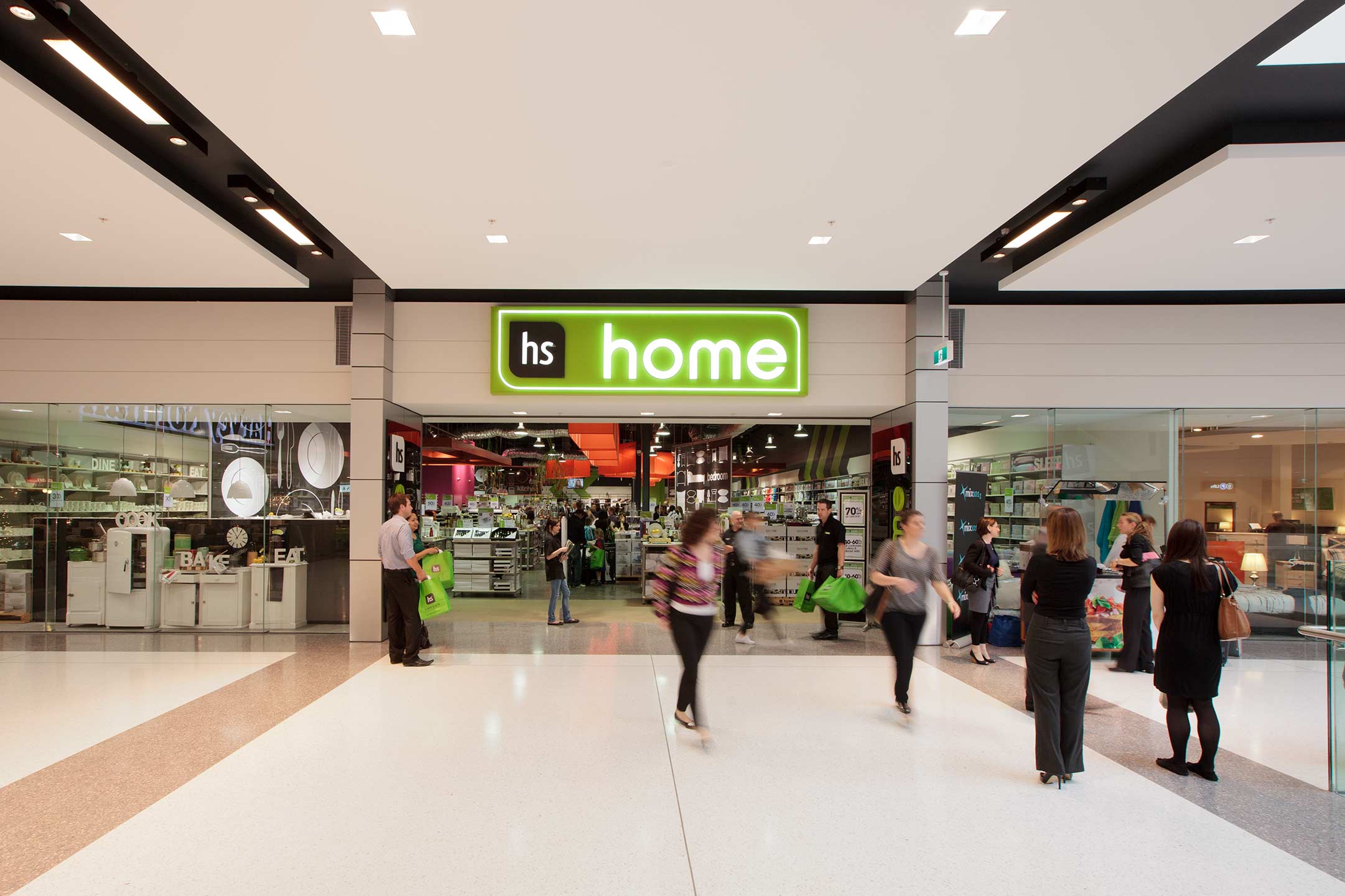
RED’s design solution was to create two stores within a store – one for Home and one for Apparel. This innovation was immediately evident to customers as they approached the wide entry divided in two by a central branding blade. New specialty type fixturing replaced the old style slat wall system and provided greater flexibility to merchandise strong wall presentations.


-Adelaide City-
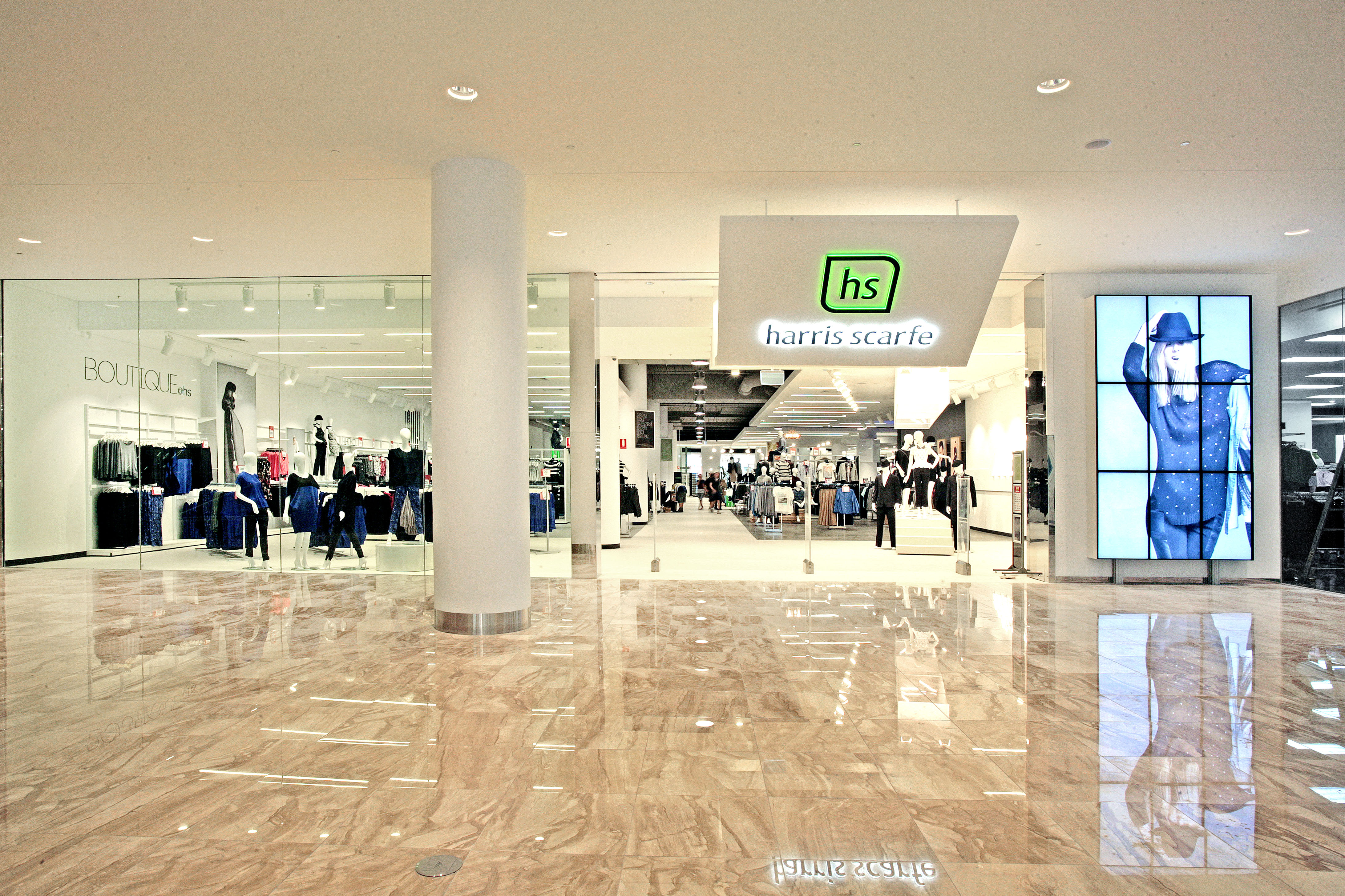
Established in 1849 in Adelaide, Harris Scarfe is one of Australia’s oldest department stores, with more than 50 stores nationwide. Having worked with Red Design Group for almost 10 years Harris Scarfe wanted us to redefine the brand in their home state with the new flagship store in Rundle Place.
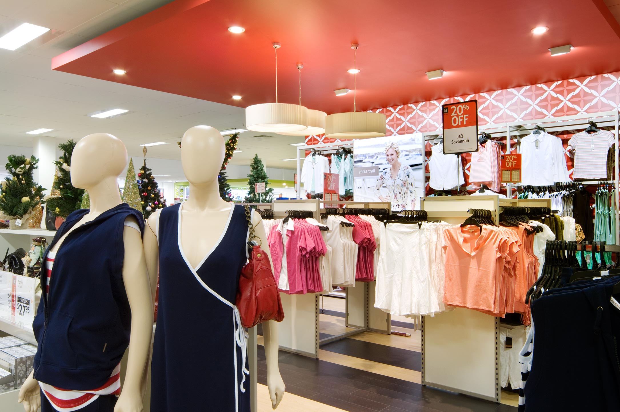
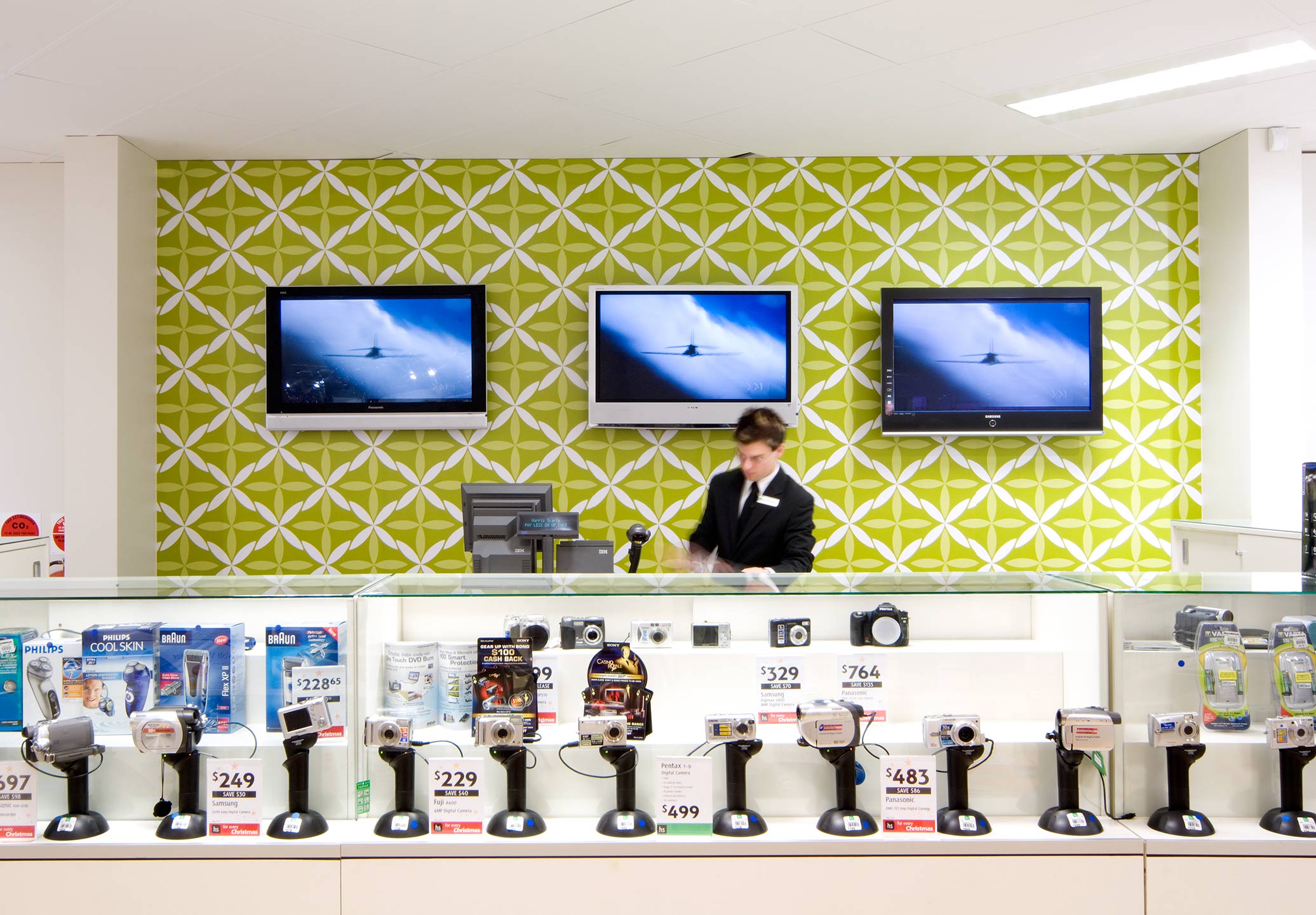
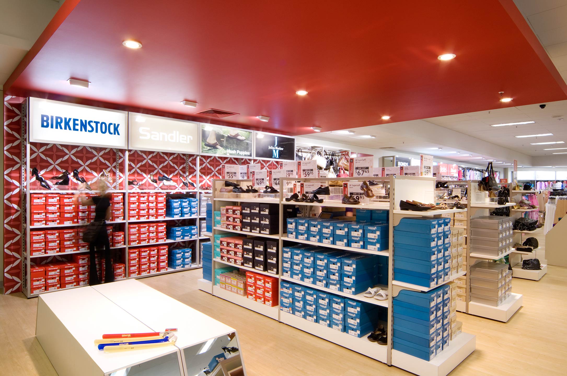
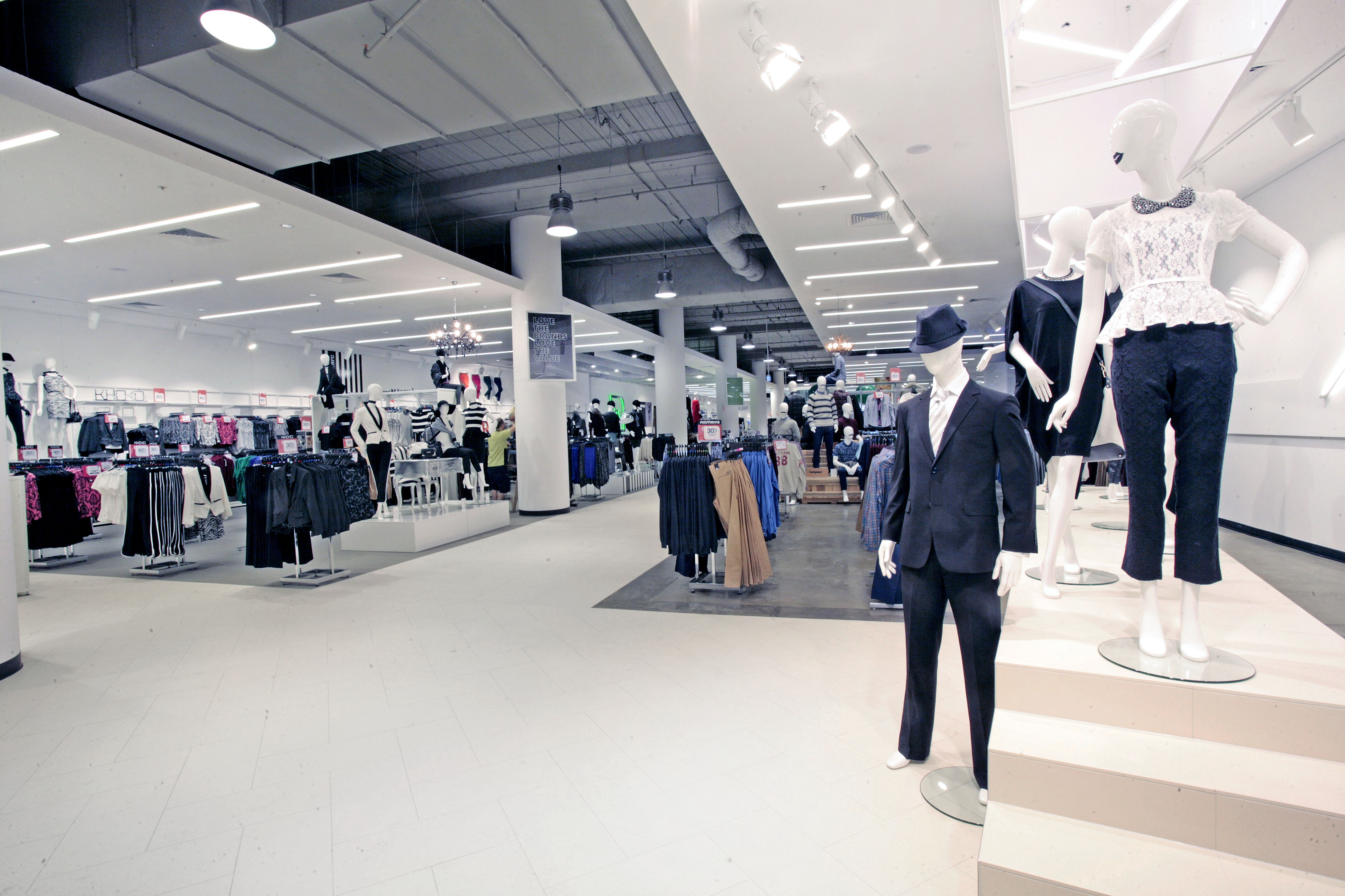
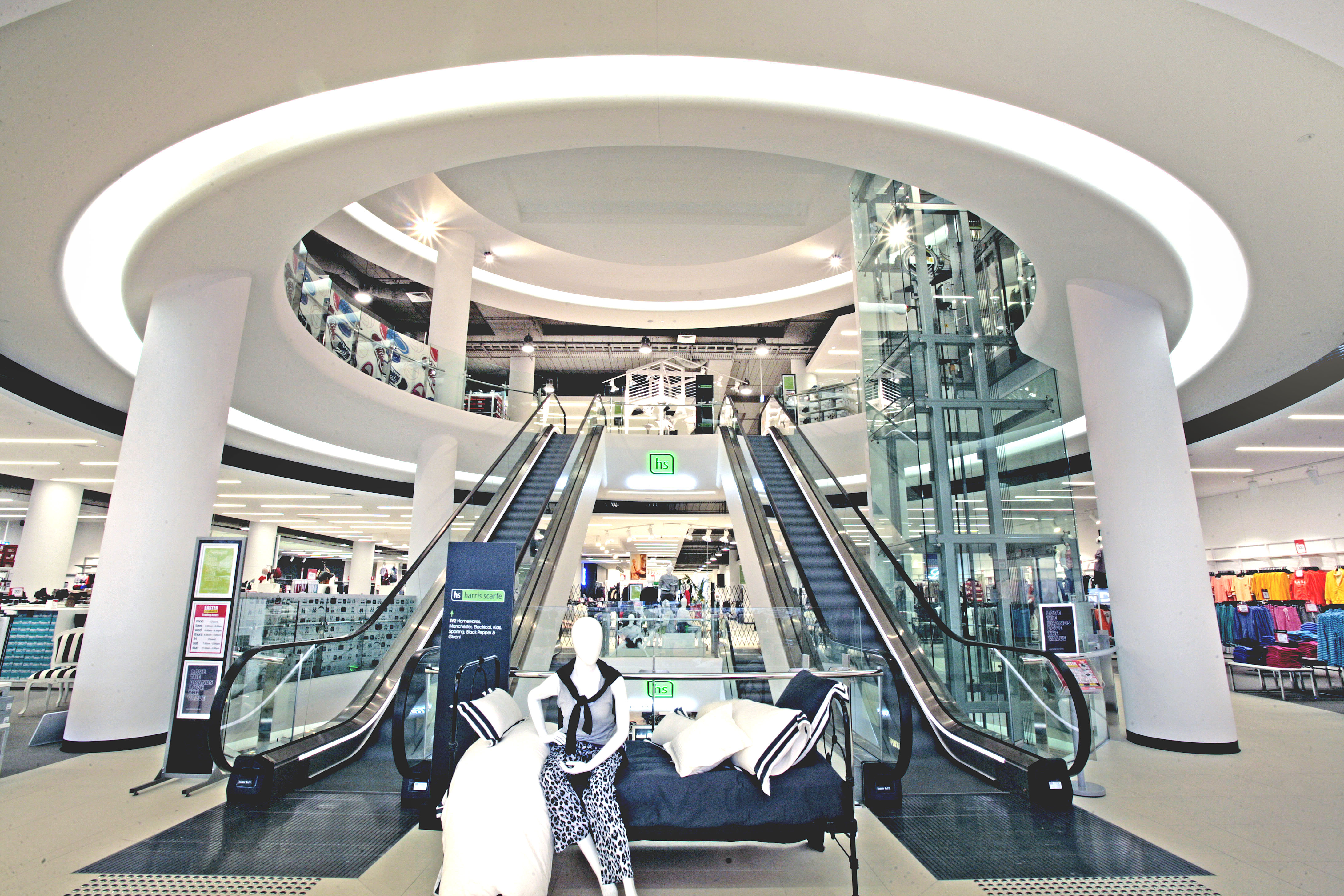
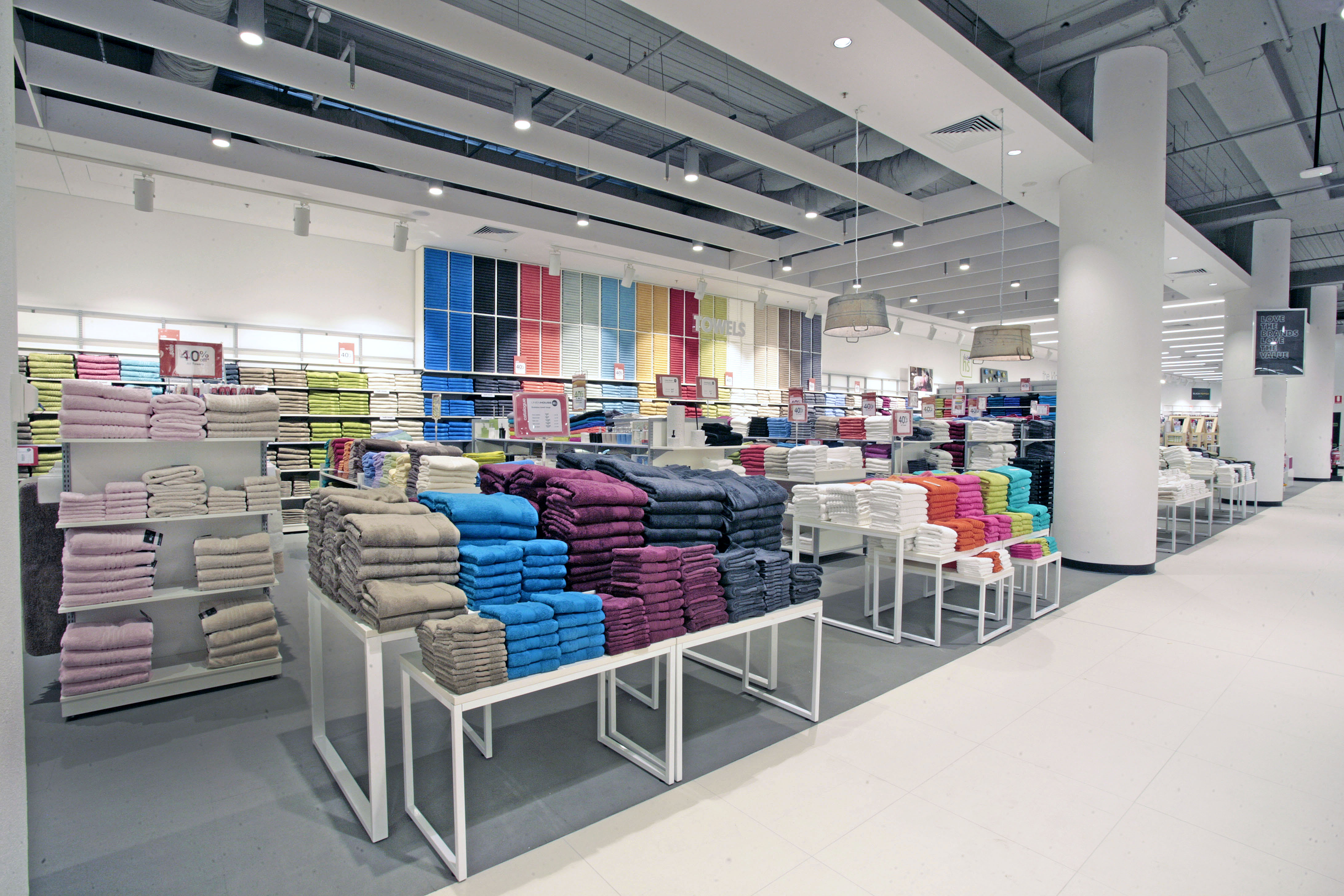
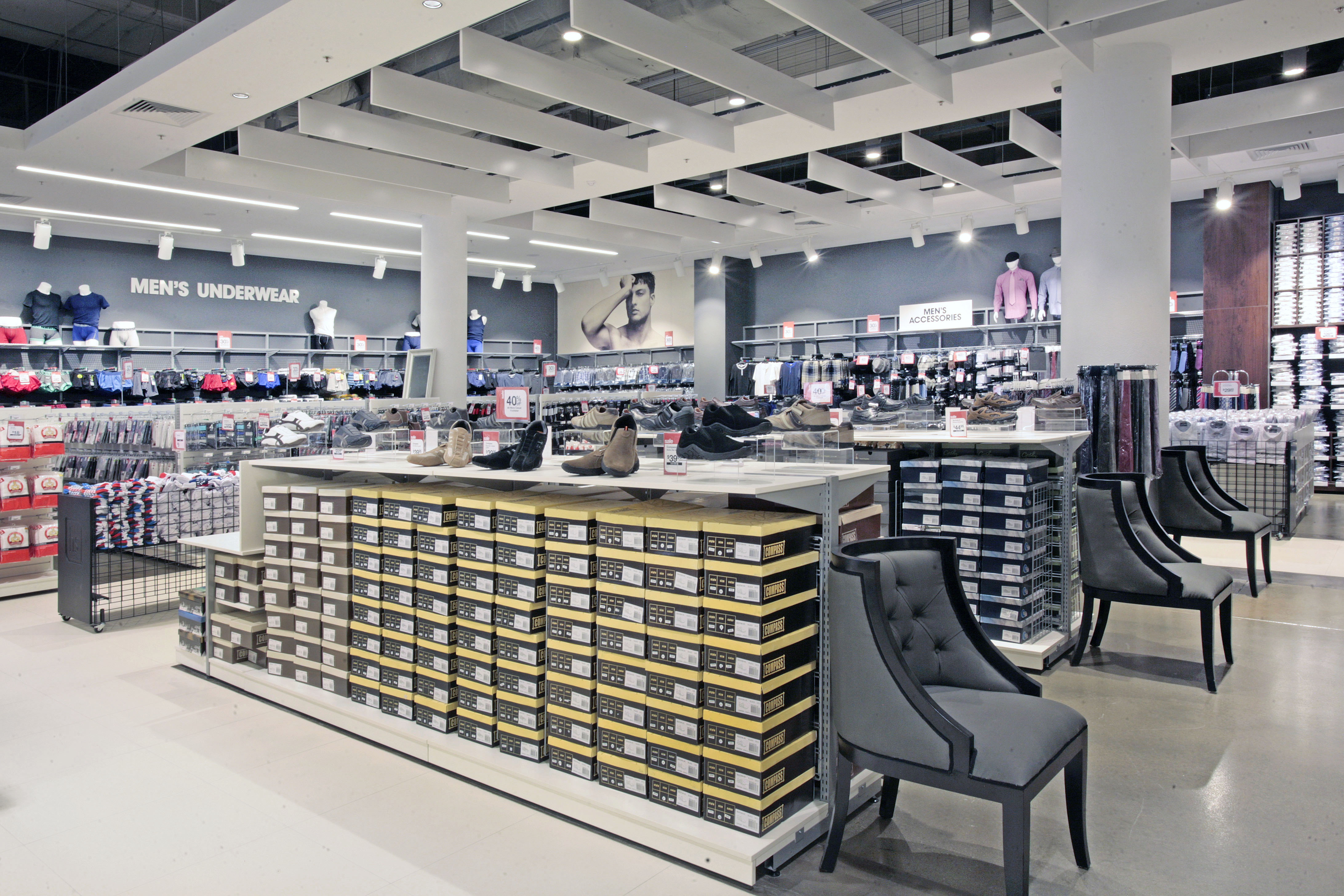
Set over 2 levels the 9000m2 store is the biggest HS in the country and getting the customer to navigate the 6000m2 upper level was the main planning challenge. Working with the in-house marketing and VM team we kept a simple generic base building, paring back the finishes to natural concrete, exposed ceilings, white fixturing and walls with pops of colour and visual interest at regular intervals along the customer journey.
Exploiting the volume of the space a 4.5m high café structure becomes a navigational icon centralised on the upper floor. Named 1849 we persuaded the client it was important the café became a representation of the HS brand rather than being handed over and branded by a local operator. The adjacent wall became a 10m long montage mural by a local artist, using as a basis the original Grenfell Street Victorian building as a nod to the past and the long connection HS has had to Adelaide. The café will also double up on one side as a display kitchen where guest chefs will have feature cooking shows on the weekends, bringing some theatre and engagement with the community.
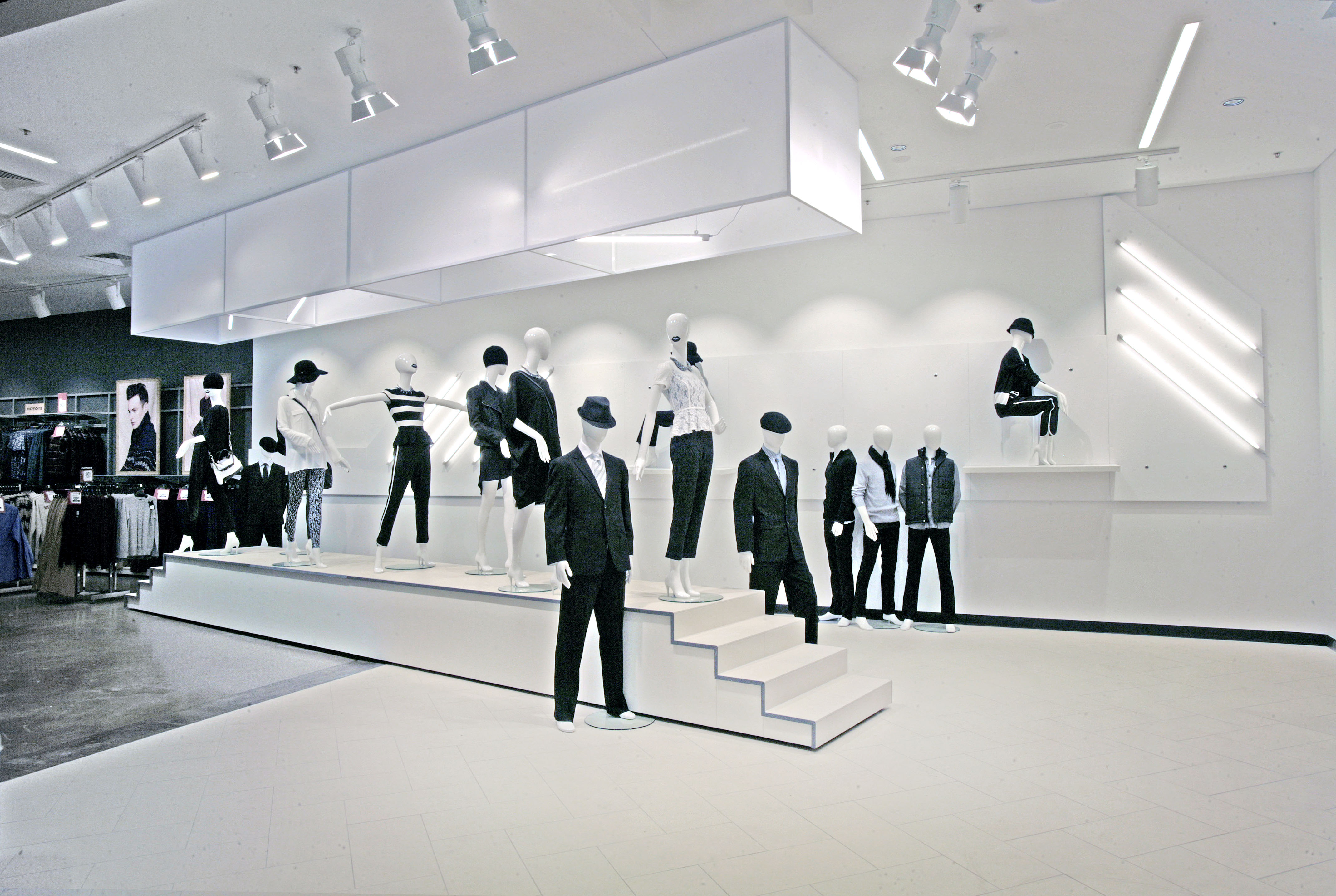
On the ground floor entry a catwalk feature for the apparel part of the business leads you into the store creating a flexible VM zone with a constantly changing entry experience. The entry signage panel itself angles into the shopfront and then breaks up into bands as it moves into the store making a dynamic entry statement and redefining the old dame of Adelaide.


-Springvale-
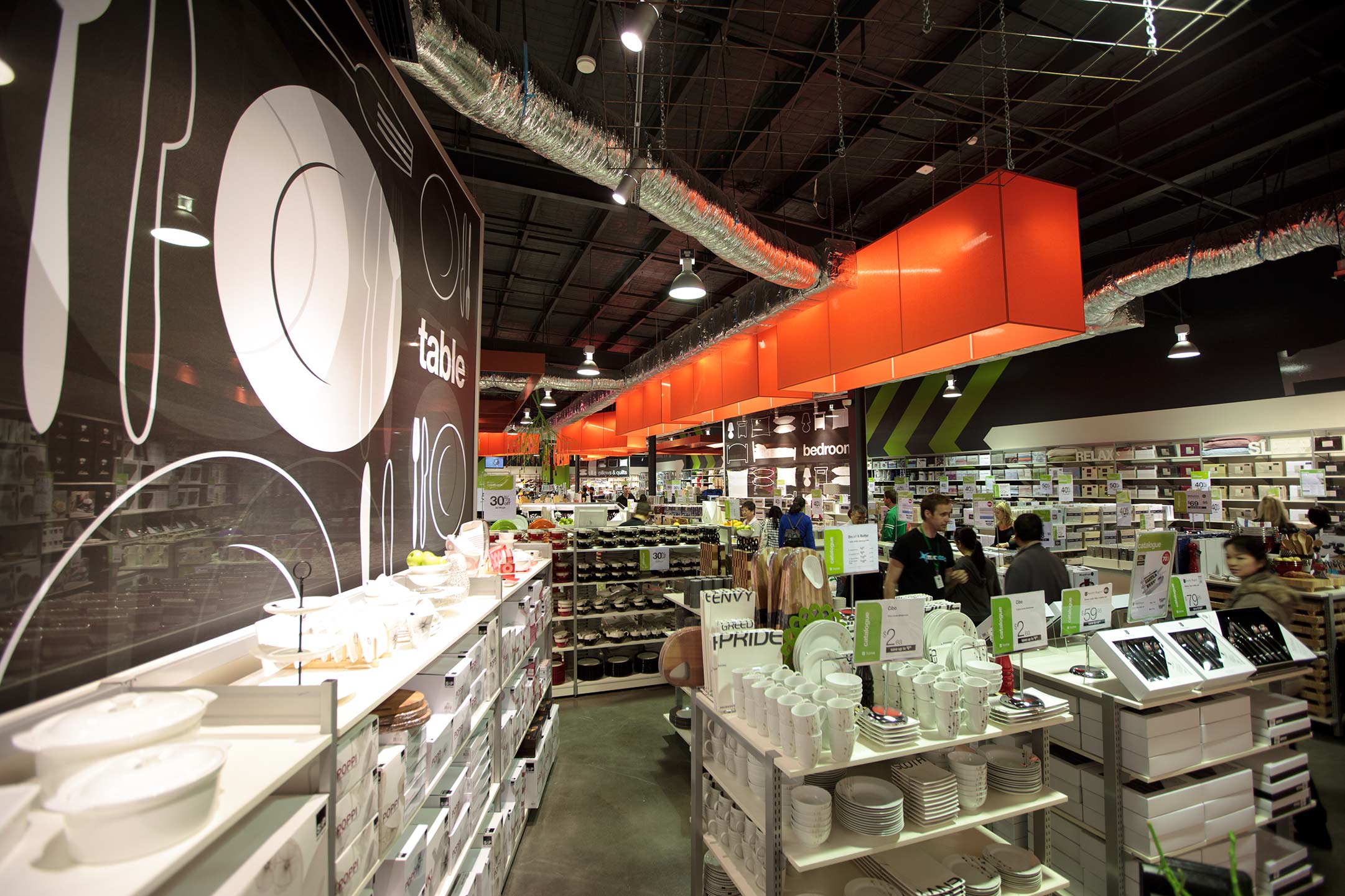
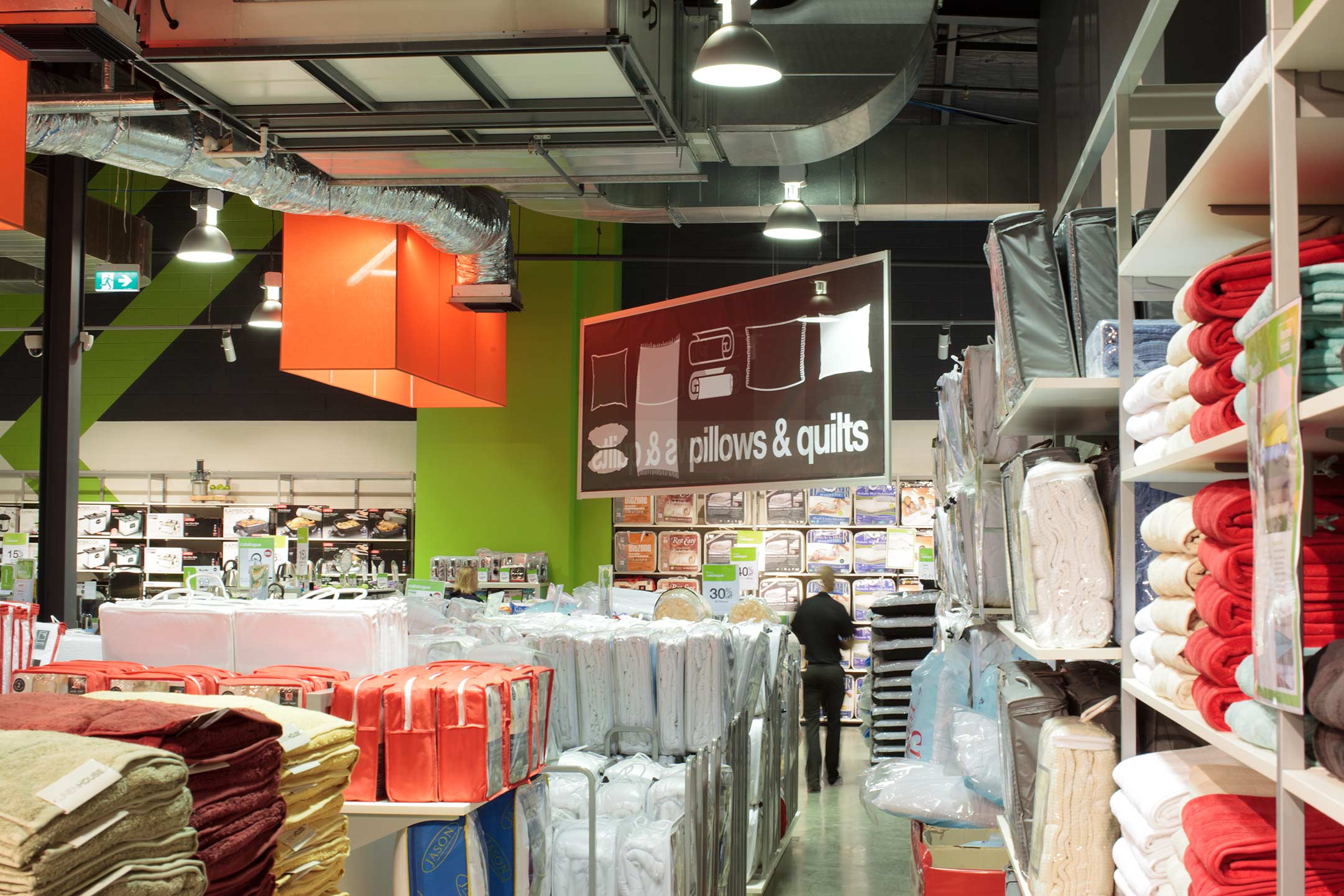
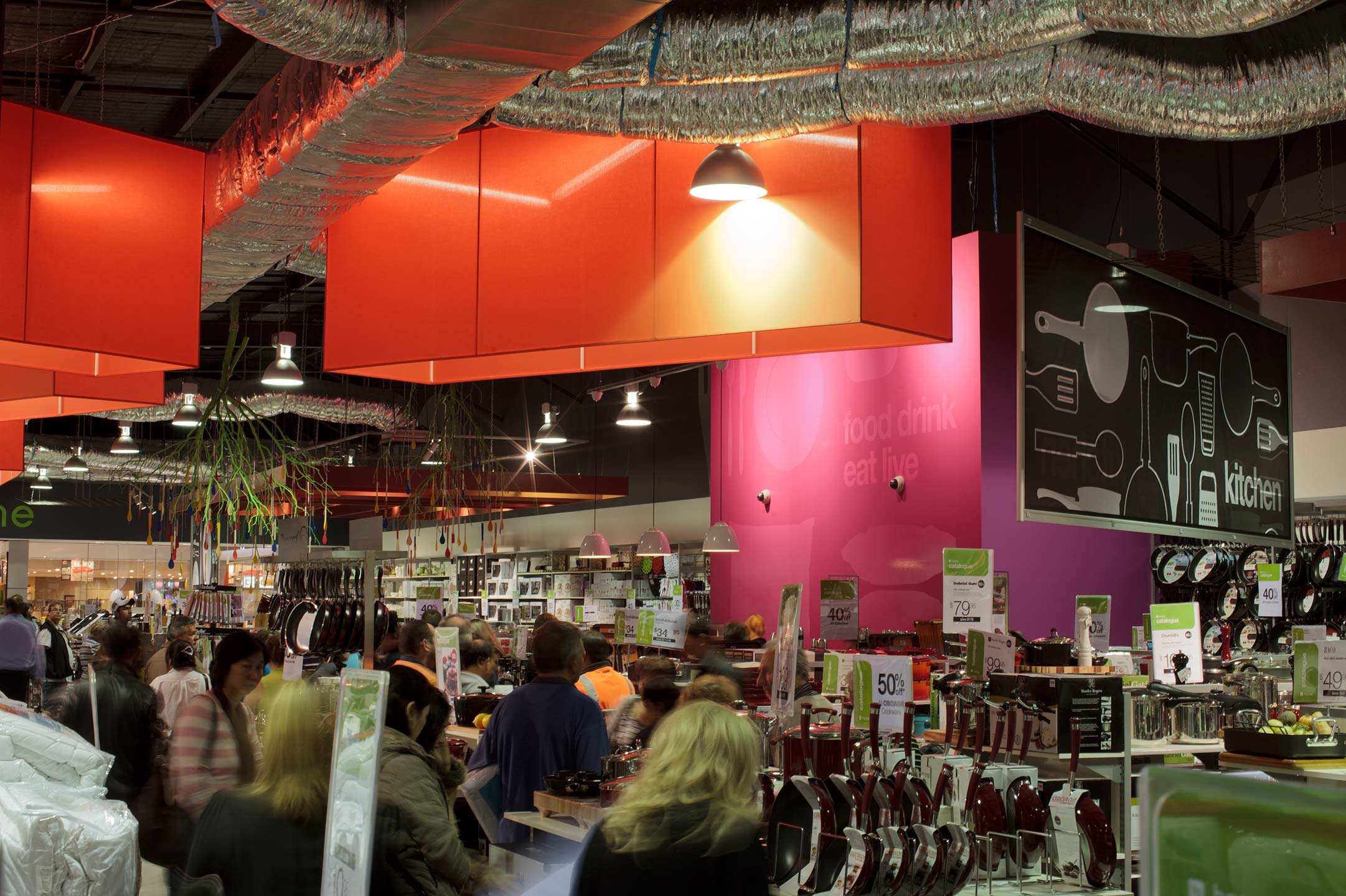
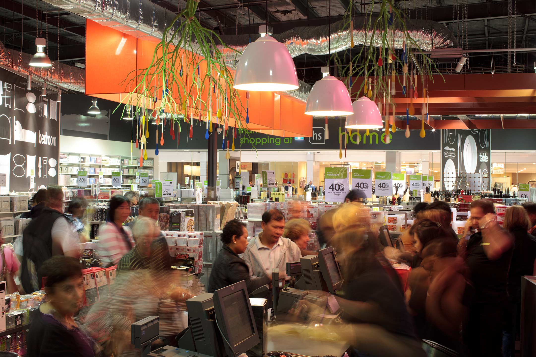
The new 880m2 store design of Harris Scarfe’s sub brand, hs home in Springvale, Melbourne, by Red Design Group is a destination in proportion, brand offer and customer experience. Its contemporary design builds on some previous ideas successfully applied for their client in the design of hs home in Adelaide’s Gepps Cross, albeit this project is pitched at a younger, dynamic audience.
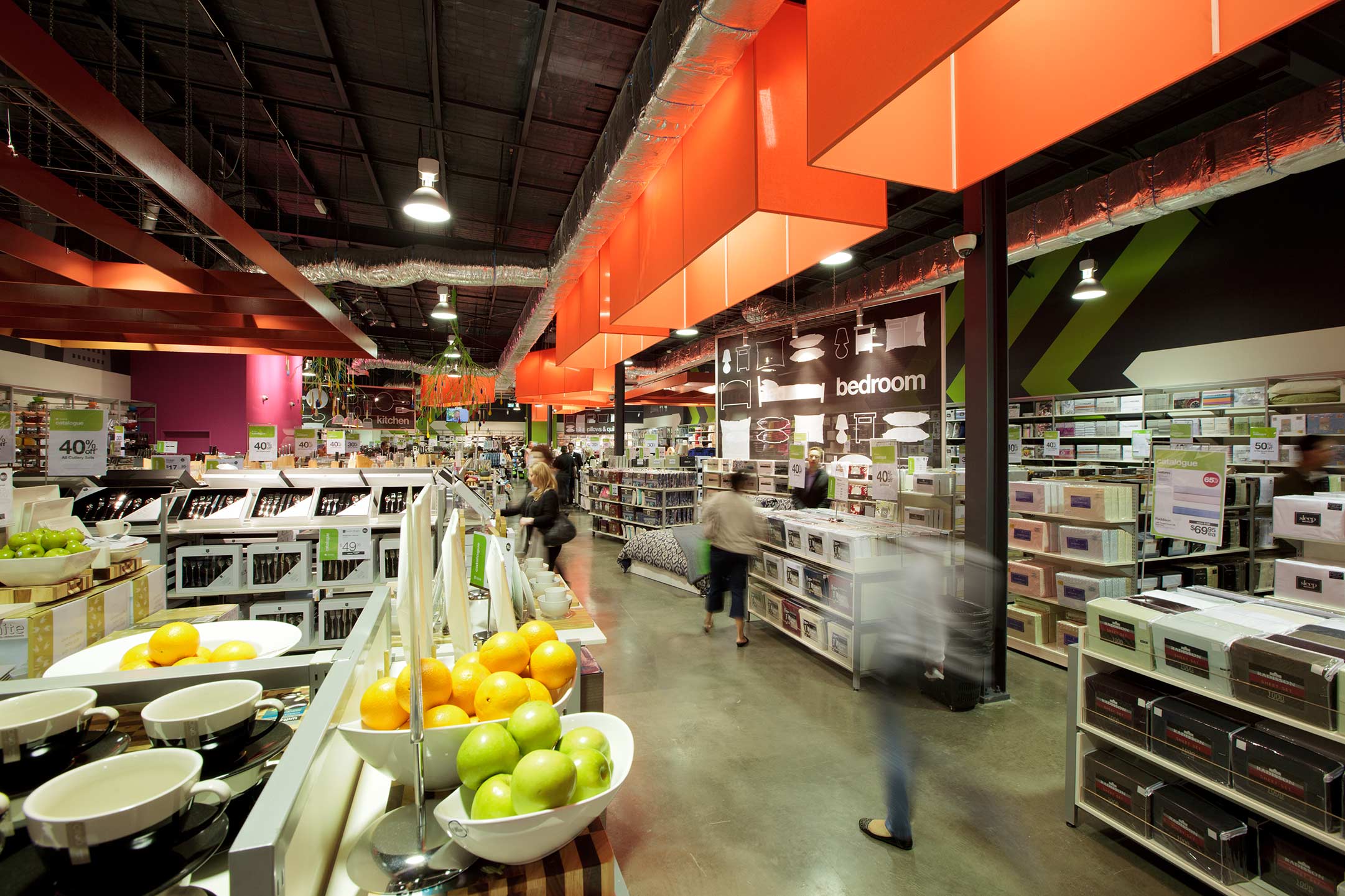
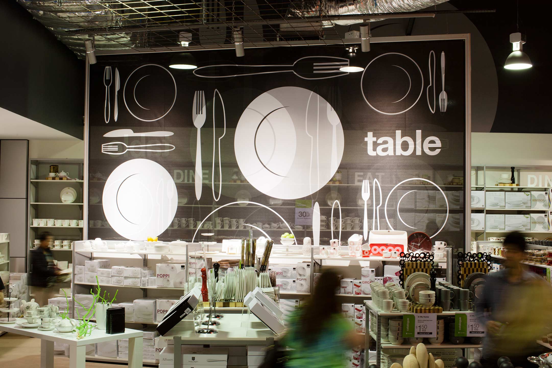
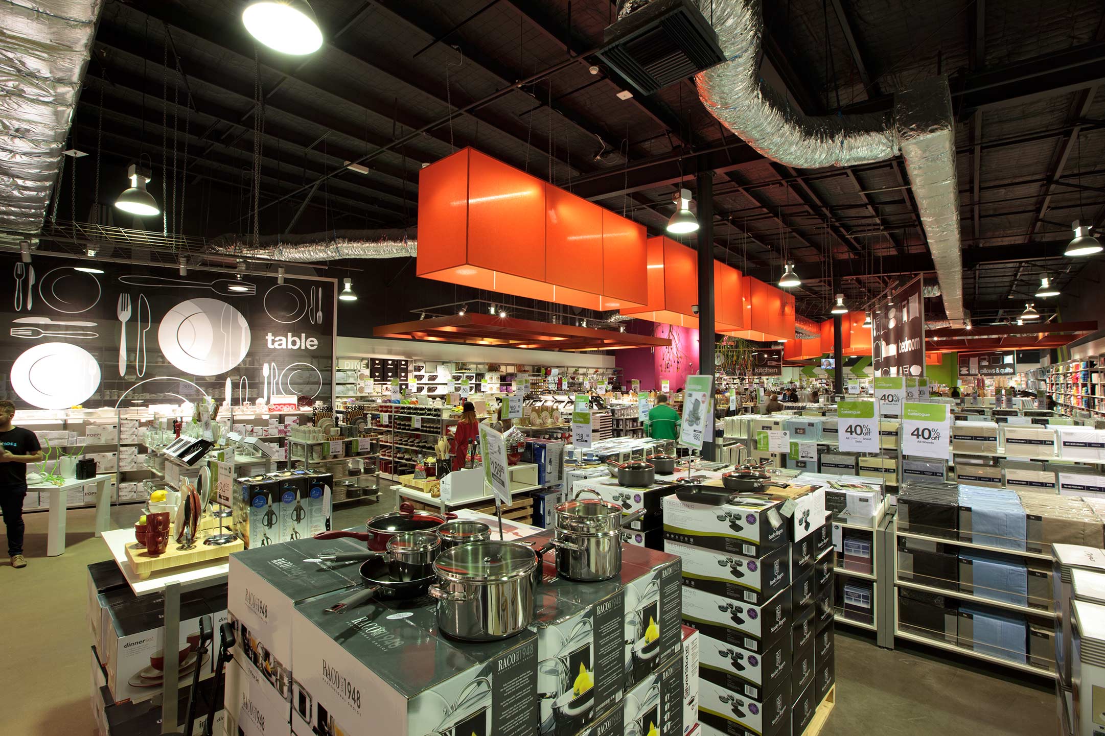
The introduction of a new casual language is one technique that helps to infuse a new twist to the latest hs home offer. Working around the notion of a four-pillar policy, long orange pendant lights lead customers from the entry through the space toward four major departments. Each is denoted by a suspended, transparent mesh, signifier element that permits unimpeded vision storewide. Their fun graphic treatment allows customers to easily identify departments. Both devices effectively reduce the perceived ceiling height and conjure more intimate shopping surrounds.
Of the various playful points of interest dotted along the journey, Red Design Group’s Creative Director Colin Bell said, “We wanted to visually stimulate the customer without watering down the products.” Angled positioning of the lighting in a diagonal fashion rather than giving way to a conventional straight aisle is a measure that functionally encourages customers to explore the space.
The captivating hot pink main sales counter is one of several big and bold, yet simply executed punches of vibrant colour. This intentional contrast to the angular green wall stripes fosters a sense of movement while incorporating the Harris Scarfe brand colours.
Leave a Reply