RED has designed a new concept which is inspired by Specsavers’ future vision for their stores.
https://www.redgp.com/specsavers/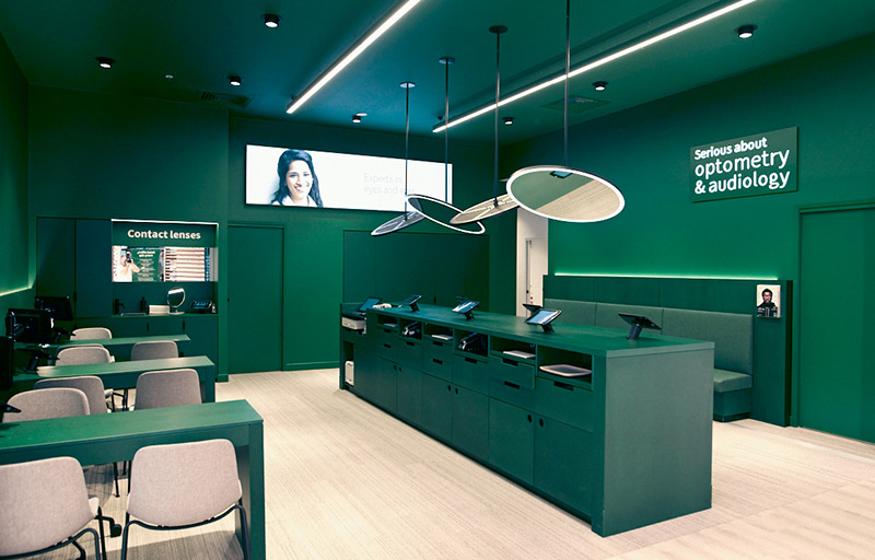
Originating in the UK, Specsavers has quickly grown to become a known Australian brand. RED Design Group was selected to partner with Specsavers to revolutionise their store experience for both customers and staff. Once immersed in the journey of getting your eyes tested for a pair of new frames, you discover, almost as if being slowly revealed to you, the sophisticated and professional optical health service and state of the art technology that sets this business apart from its competition.
It becomes evident that their winning formula, known to those closest to the brand, had to be told through their stores as it would benefit millions of people.
Everyone in the Specsavers business contributed, sharing their knowledge and keeping an open mind to the possibilities. Customer insights, product ranging, marketing, optometry, retail, IT, management and the board of management, all collaborated to knowledge sharing. In addition, discussions with staff, customers, business owners and management allowed efficiencies in operational flow to be explored and challenged.
RED’s conclusion was that, what customers thought conflicted with the true sophistication of the business. The optical services performed were state of the art, just nobody could see it.
Our design strategy was to create a customer journey that exhibits all the great qualities of Specsavers in an organised fashion. The new planning of the store allows customers to move freely around without barriers and clearly identify the stages of the journey relevant to their needs. There are no more queues banking up towards the storefront as staff can triage efficiently moving around freely and choosing where to consult with customers depending on their preference and constraints.
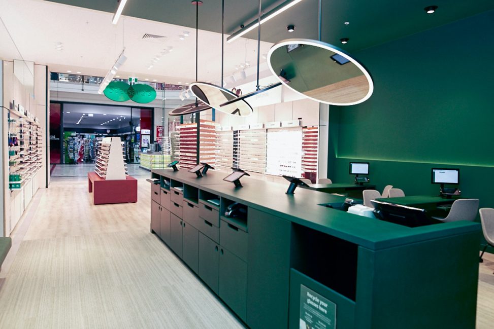
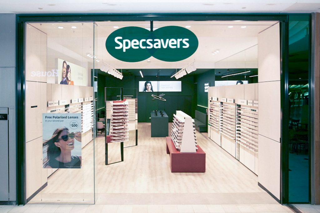
Creating two distinct zones which you can see visibly from the shopfront – the retail zone and the service zone, presents a unified offer on a grand scale complimentary to the Specsavers brand.
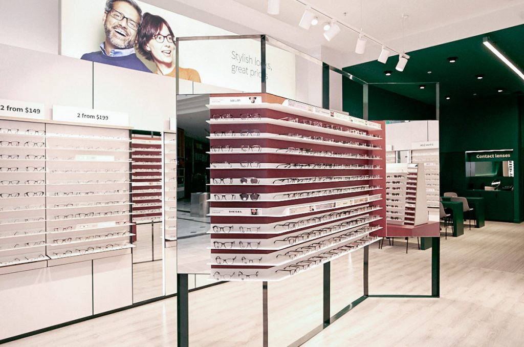
The retail zone was designed to encourage customers to discover and feel confident when trying on glasses. The space is inviting, well illuminated with state-of-the-art LED dual colour temperature fittings and layered with simple yet stylish details that complement the frame product on display. Helpful messaging dotted throughout the store informs and educates customers as they explore and select frames.
The service zone, which is a natural extension from the retail space, focuses on delivering professional optical health service. This area is moody in dark green with the feeling of cocooning and calmness, the floors are softer and the lighting is indirect. All intended to slow the pace and encourage conversation and dwell. By making these two zones visible from the shopfront, the whole aperture into the store opened up allowing for major sightlines and the ability to project the message of affordability, range, and state of the art optical service.
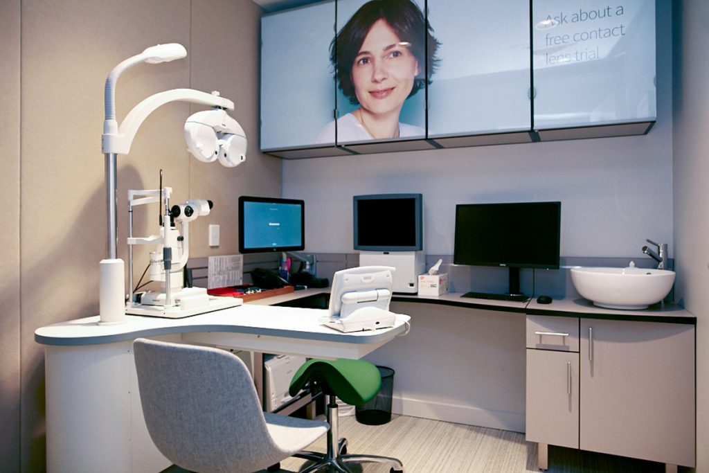
Consulting rooms have been refined, creating a relaxed and personalised experience for every customer while being assessed by a highly trained professional.
Staff training has been undertaken to ensure they understand and appreciate the driving principles embedded into the evolutionary concept as well as the subtleties that mobilise the Specsavers customer.
Specsavers have delivered a design solution that manages to uphold the price and affordability perception, while amplifying their seriousness about optical health service.
Customers and staff have been united into a journey that builds trust, engagement and loyalty for a brand that cares for our most precious asset, our eyes.
A good example of New Retail – we believe.

Leave a Reply