Whilst the idea of retailers having their own brands has been around for nearly a century, and in some developed markets in Europe has reached a penetration of over 40%, private label is still in the early stages of growth in Asian retail.
I have worked in the private label space for many years, both in food and in fashion.
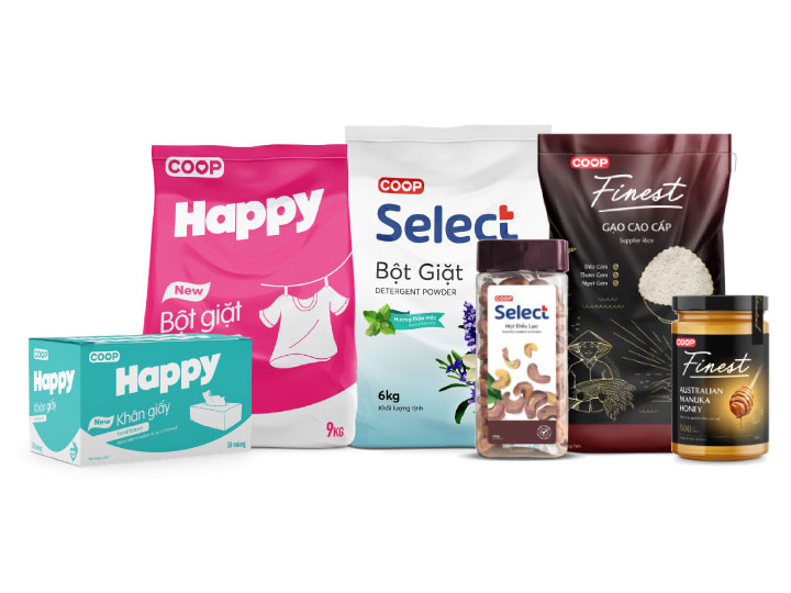
So I was delighted when RED won a very large project with Saigon Co.op, Vietnam’s largest supermarket group, to reinvent their private label program.
After months of research and strategy work from me, our design team created a new 3 tier private label hierarchy – designed 3 new brands – and a new trust mark for the parent company – Co.op.
Apart from bringing a fresh look to their packaging, the 3 new private brands have distinct personalities ranging from a value brand named Happy, a mainstream brand called Select, and Finest – a more premium label.
The project is currently the largest for our newly established Vietnam design team – and we are mid-way through rebranding the entire private label range which is in excess of 400 products.
Creatively we had a lot of fun doing the naming research and development, conscious that we had a mainly English speaking team at the start of the project.
The brand identities were designed in Melbourne – but as our new Vietnamese team members joined our growing team in Ho Chi Minh City, they soon started to develop some unique and quite beautiful packaging concepts that could be best described as “Modern Vietnamese”.
It was fascinating to work with our clients in HCMC who clearly knew their products really well, and had a far better understanding of the subtleties of the local culture than us.
But we were able to bring a fresh perspective, a western influence of colour, simplicity and structure, combining well with the iconic imagery of Vietnam.
Like consumers everywhere, the Vietnamese shopper is very savvy, and we had to be on our toes when it came to selecting images, vector graphics or doing our own hand illustrations.
One memorable example was a package we designed for Saigon Co.op’s private label white rice.
We created an attractive line pattern that mimicked the curves of the iconic mountain-side terraced rice fields we have all seen in tourist brochures.
We thought it looked great.
But a problem was quickly highlighted by the client team – the rice variety in the pack was known to be grown in low lying fields and flat land – not on hill-sides.
The Vietnamese consumer is very savvy – and would soon pick up the error.
The solution was designed overnight – a new lined based pattern that more accurately represented the area where the crops was grown.
These are the subtleties of private label marketing – and it is an advantage that retailers can have over the international brands.
We have learned so much about the local Vietnamese market in the process, and have developed a great working relationship with the client team who are responsible for rebranding their entire private label range.
It’s a huge task!
Nielsen and Kantar research tells us that the penetration of private label in Vietnam is still very low – well below 5% – and that Traditional trade stills accounts for over 80% of retail sales.
But we expect in coming years, as the emerging consumers migrate from wet markets to supermarkets, that private label sales will increase rapidly and play an important role in building the share of Modern trade in this fast growing Asian nation.
We are very proud of our new brand design team in Ho Chi Minh City – thanks Mai, Tristan, Helena, Sally, Thang, Spidey and Loc.
Congratulations also to Riesa and Sarah in our Melbourne office for their creative design, inspiration and art direction.
Thanks also to Taylor for your more recent contribution.
Our clients at Saigon Co.op are great to work with – and I liked to think we have a really close team – client and agency – collaborating on this truly major project.
Cảm ơn bạn.
Leave a Reply