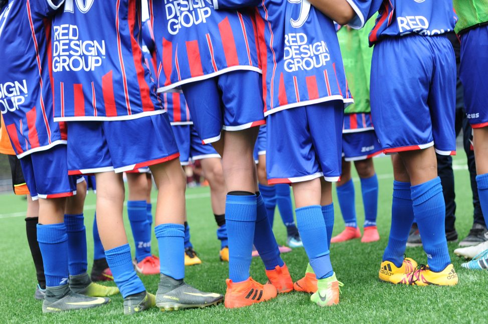
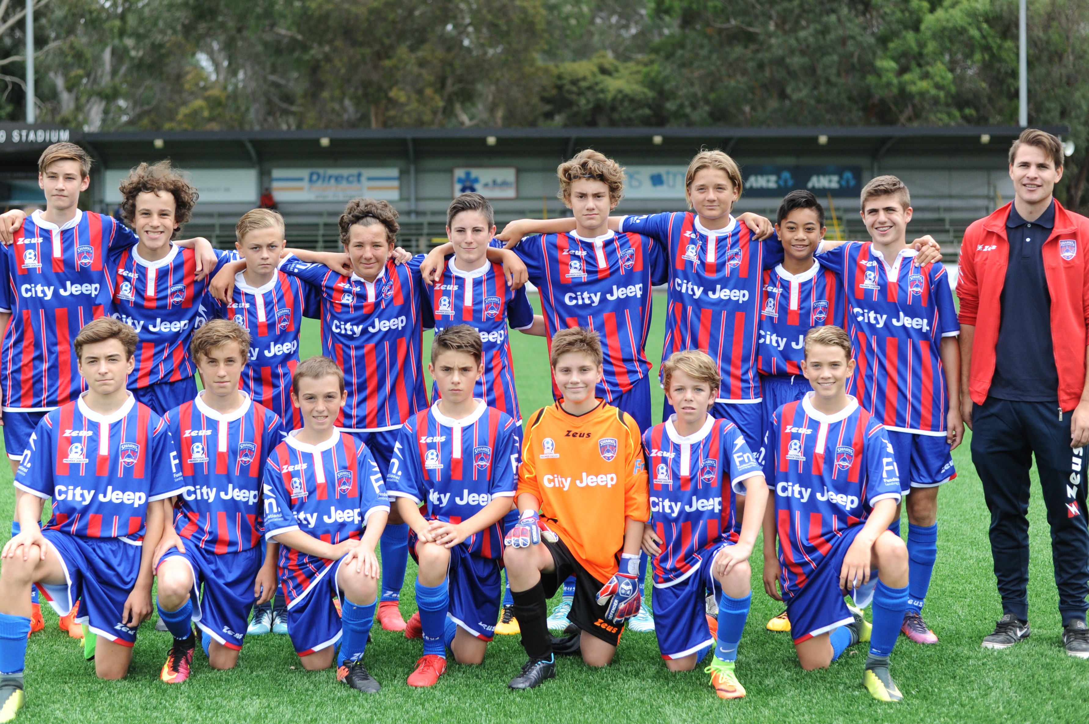
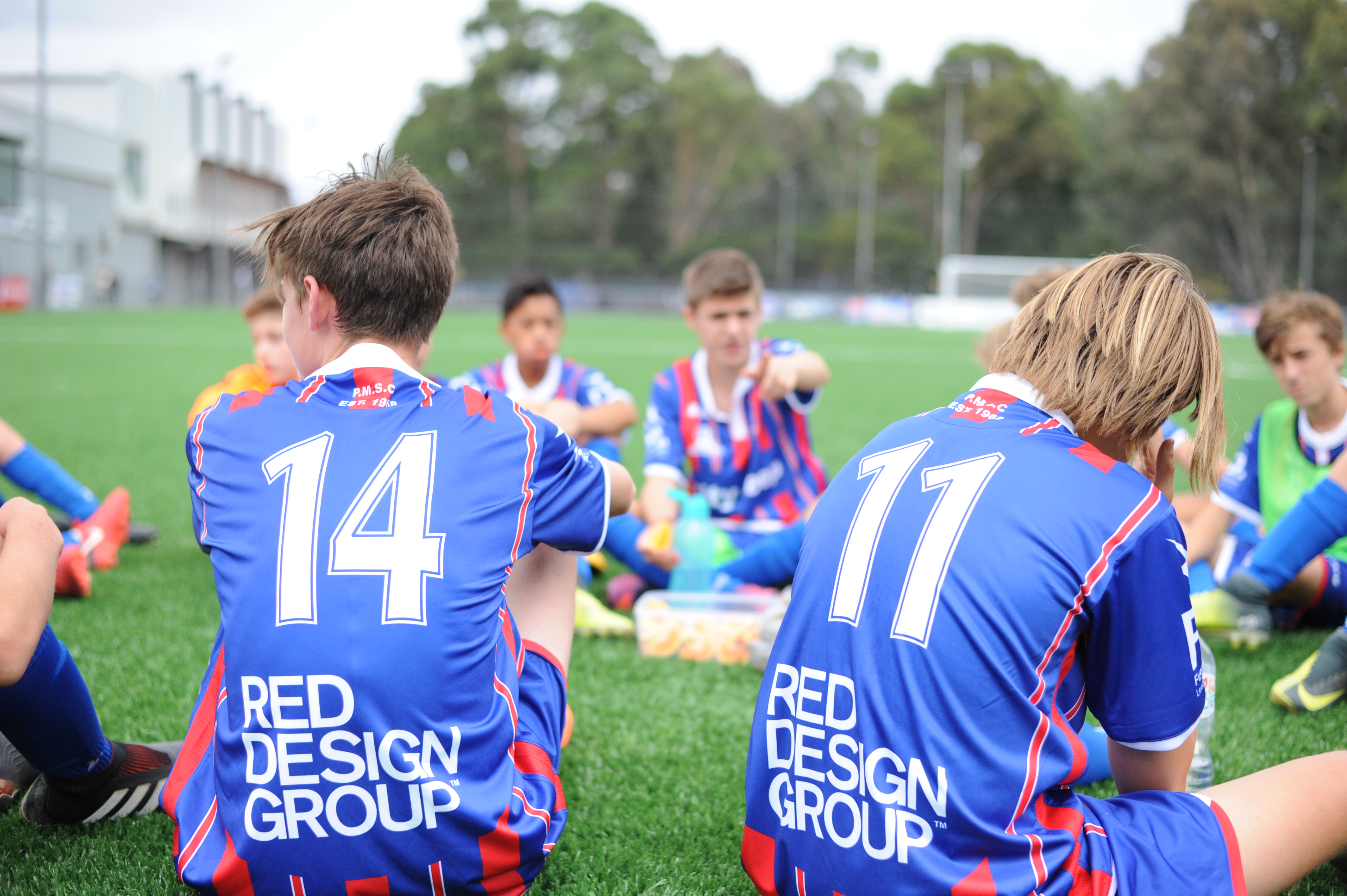
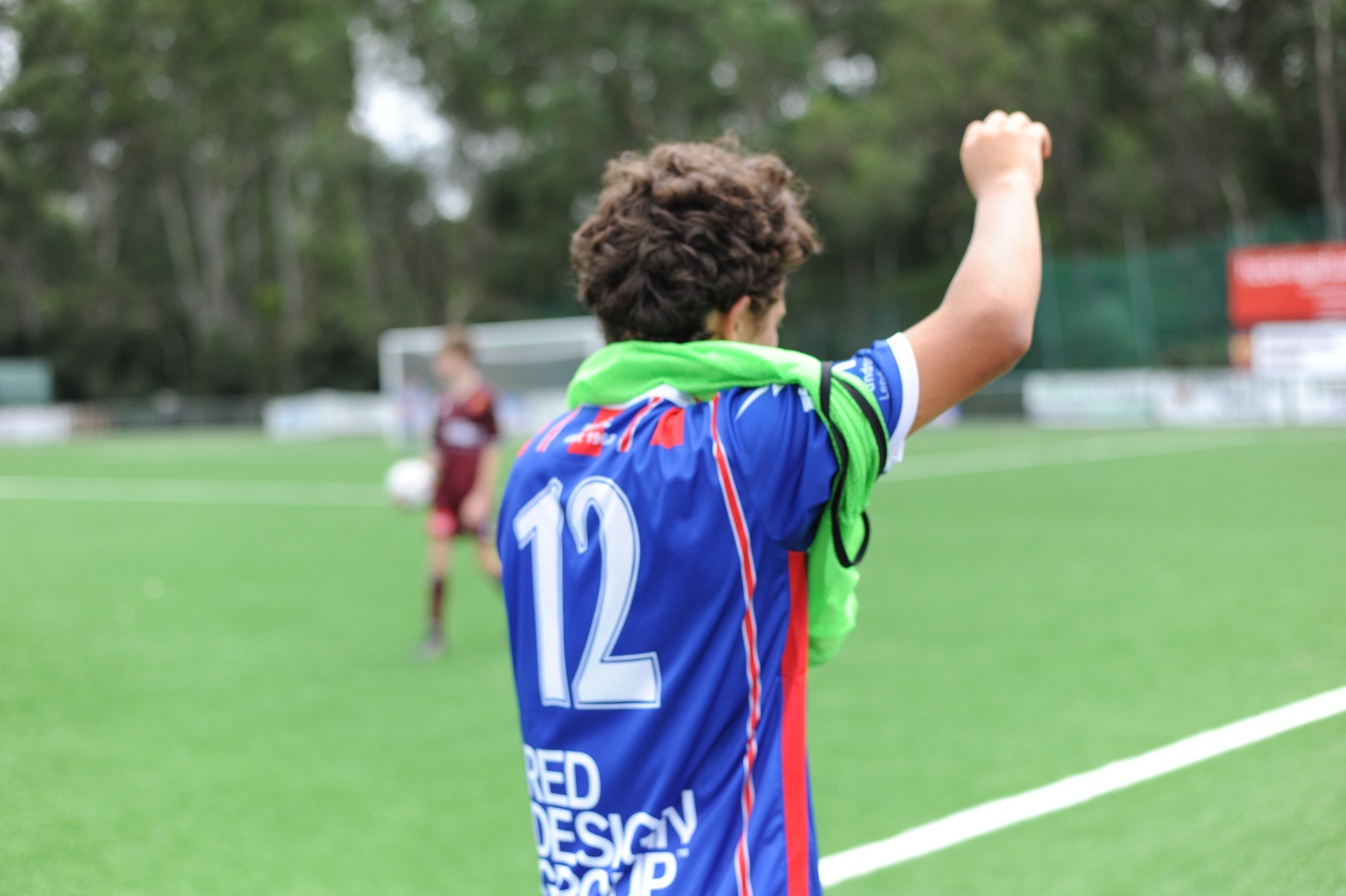
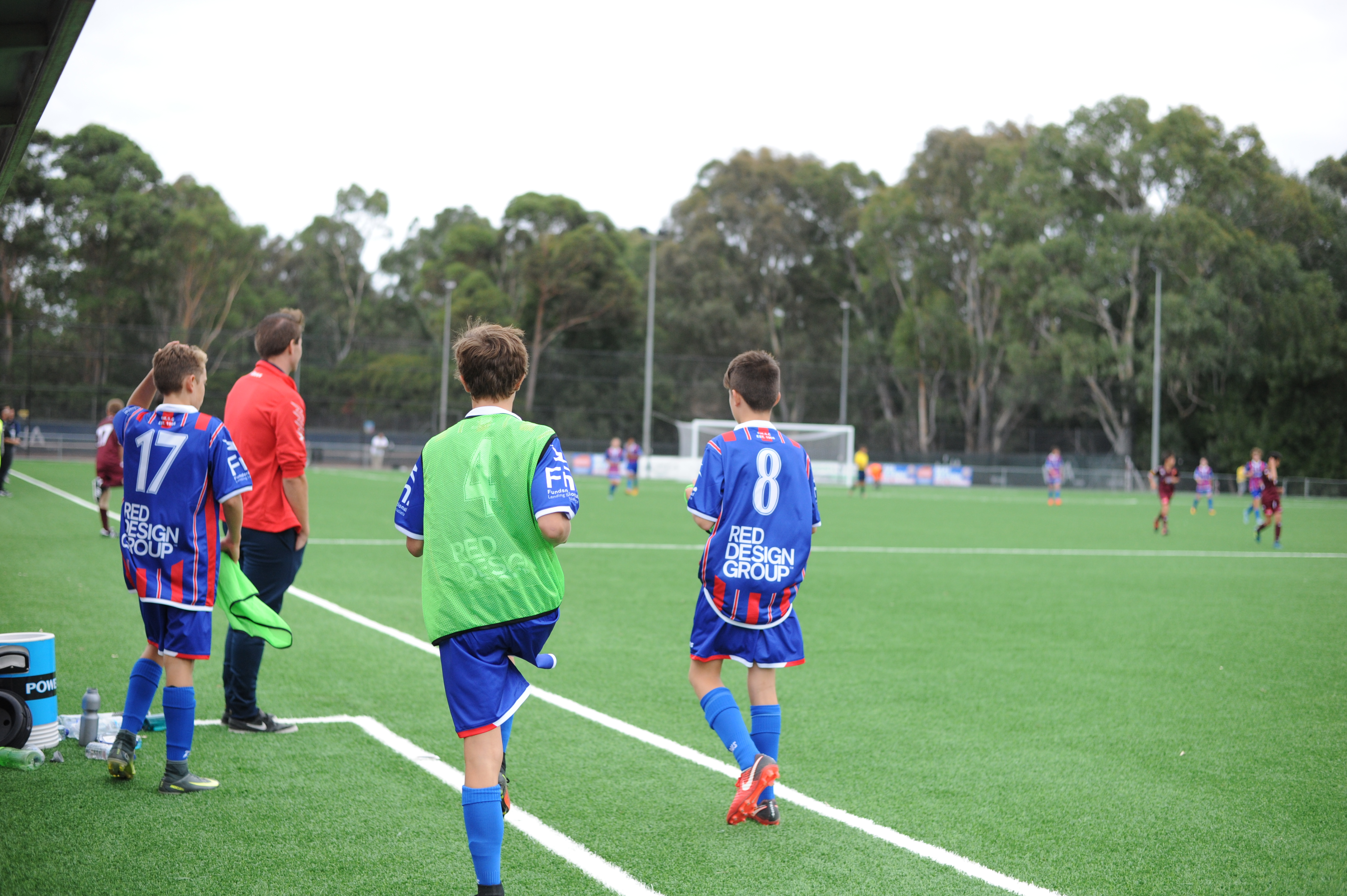
Red Design Group sponsors the Port Melbourne Soccer Club, and has a seat on the board held by Design Principal of Red Design Group, Darren Hose.
The highly competitive Under 14 team in the photograph competes in the National Premier Leagues (NPL), an elite national soccer competition in Australia in the second tier below the A-League.
Our branding team at Red Design Group is very excited to present the new Port Melbourne Soccer Club logo, representing an important milestone for the Club as it turns 50 during the 2018 season.
![]()
To commemorate this event we thought it important to show the future while also acknowledge the club’s heritage.
We proposed to return to their original colours RED and BLUE.
The red stripes match the size and spacing of their the club’s brand logo developed 50 years ago.
Our contemporary shark is aimed at children and adults and is symbolic of a progressive future for (the Club)
The shark incorporates the outline of a Spartan’s helmet, a testament to united loyalty and competitive spirit.
Encapsulating all these elements is a shield, synonymous with so many great sporting clubs.
We’ve gained approval from both NPL Victoria & Football Federation Victoria for our new logo, and are looking forward to seeing it compete on the sporting field, successfully celebrating 50 years of the Port Melbourne Soccer Club.
Leave a Reply